Journey of SVG -- (1) "Drawing"
Preface
Recently, I've started my study about the basic of SVG, just because I thought I would use it quite often in my current job(but actually not), nevertheless it's always amazing to see how svg can make the animation on web to reach the next level, also let users to see the potential of website, and making any fancy effect based on enhancing user experience.
What we are about to do: Drawing Animation
The drawing animation is what we used to see a lot in movie, motion graphic, and it's exciting for me when seeing some developers put this on web. In my opinion, the best timing for doing this is when the page loading, the logo shows up in a slow pace by drawing effection, it's a nice and elegant welcome, isn't it?
My Assignment Today
I am gonna make a logo which will be hide at first, and then showing up by drawing way since the page starts loading, before that, we should try to figure out the secret behind it.
The Attributes We Shuold Know
There are 2 attributes that can help us to achieve it:
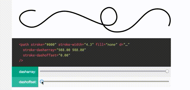
01. stroke-dasharray
This attribute can make the stroke become dash line, it has 2 values, *the 1st. one defines the length of the line, the 2nd. one defines the distance between each dash line.
*
#demo line {
  stroke-dasharray: 50 50;
}
<svg id="demo" height="100" width="100%" stroke-width="1" stroke="orange">
  <line x1="0" y1="20" x2="500" y2="20"></line>
</svg>

The below one has larger attributes, you can see the apparently difference from the above one.
#demo line {
  stroke-dasharray: 100 100;
}
<svg id="demo" height="100" width="100%" stroke-width="1" stroke="orange">
  <line x1="0" y1="20" x2="500" y2="20"></line>
</svg>

02. stroke-dashoffset
This attributes specifies the distance where the dash line should start at.
It means we can move dash line back and forth by this.
From the example below, when I set stroke-dashoffset: -100,the dash line move toward to right by 100px.
#demo line {
  stroke-dasharray: 50 50;
  stroke-dashoffset: -100;
}
<svg id="demo" height="100" width="100%" stroke-width="1" stroke="orange">
  <line x1="0" y1="20" x2="500" y2="20"></line>
</svg>

Well, now you can image, if the value of stroke-dasharray equals to the length of path, it will look like a original path without any dash, and set stroke-dashoffset to the value equals to the length of path also, you will see the result like below.
When the dashoffset is just the same as the whole path, the whole path will be covered by the space which is between the dash line, so it looks empty.
Time to Animate
There are several ways can help us to build the animation, I choosed to use css transition to draw the line first, and then use css animation to present the fill part (Be aware, css animation isn't supported in IE9.). The SMIL may not be recommended since it isn't supported in IE and doesn't perform well in Chrome & Safari.
Basicly the drawing animation I built this time is based on the one built by Jake Archibald, he wrote a really good tutorial article about drawing in SVG, helping me a lot.
Meanwhile,I downloaded a nice logo from houyhnhnm online magazine, which I visit almost everyday, I used this just for making this practice more interesting, of course you can choose any image you like.
After having your image in SVG, it might look like this(depending on you SVG image).
<path class="path_01 whiteFill " fill="none" stroke="black" stroke-width="1"
d="M211.8,144.3c0.3,11.2-1.9,21.7-9.1,30.7c-1.9,2.4-4.4,4.3-7.7,3.6c-3.6-0.7-4.4-3.9-4.7-6.9 c-1"/>
And here is JS
  // get the number of path in document
  // calculate the length first so it can be saved as cache,
  // then it won't need to calculate every time in loop.
  var MaxLeng = document.getElementsByTagName('path').length;

  // use loop to set css attribute each path
  for( var i = 1; i <= MaxLeng; i++ ) {

      var className = ".path_0"+i, // each class name of path
          path = document.querySelector(className), //select the path
          length = path.getTotalLength(); // get the length of it

      // Clear any previous transition
      path.style.transition = path.style.WebkitTransition =
        'none';
      // Set up the starting positions
      path.style.strokeDasharray = length + ' ' + length;
      path.style.strokeDashoffset = length;
      // Trigger a layout so styles are calculated & the browser
      // picks up the starting position before animating
      path.getBoundingClientRect();
      // Define our transition
      path.style.transition = path.style.WebkitTransition =
        'all 4s ease-in-out';
      // Go!
      path.style.strokeDashoffset = '0';

  }
Like I've mentioned above, the code I write in this case is based on Jake Archibald've done in his tutorial, and the reason why using getBoundingClientRect method is still something I need to figure out. I've tried to do this without it, but it didn't work.
Reference:
Developing Diary
- 2016/08/26
- The addClass() method doesn't work on svg element, I have to use attr() instead. Check This.